
What does Ozon brand stand for?
Brand personality traits
Delivery to Mars?
We might as well!
We might as well!
Humane
Open
Lively
We communicate with people in their language and avoid any association with sophisticated technology. For example, we have removed .ru from our company name.
We want to get to know our users better. We value their feedback. That is why we are building an open brand — outgoing, sincere and friendly.
Ozon is lively and genuine, it is not afraid to show emotions; it knows how to be happy and empathetic, funny and thoughtful, but the main thing is to take care of people and help them solve urgent tasks.
Our company is actively growing and have the most flexible approach to branding. With a 360° concept, we can easily adapt our corporate identity to any scenario and brand assets.
Ozon is a modern e-commerce platform. We develop services for entrepreneurs and buyers all over the country and create products that as comfortable and as intuitive to use as possible


Русский
Русский
Меню для мобильных адаптивов

The life and soul of the party
Tone
We talk to the user as equals — in a friendly way without assuming superiority. To make a good impression, a neutral tone of voice is crucial in difficult situations and when talking to an audience that we are meeting for the first time. At the same time, we try not to sound dull or too formal — when appropriate, communication can be bold and emotional.
Language
Humor
We communicate in simple language, avoiding complicated terms, acronyms and jargon. Our messages are straightforward and can be understood by the widest audience we can reach.
We're funny as long as it doesn’t result in offensive utterances. That's why we only make jokes when the user's task is complete, and we don't joke about sensitive issues.
Brand system
A brand system is a set of rules to work with Ozon's visual style. It influences our products' appearance, communicates brand awareness and inspires emotional response. The brand system ensures that our offline and digital products follow the same brand guidelines and have a predictable result.


Logo
Icon
Color palette
Bright blue combined with rich crimson adds emotion and expressiveness to the brand.
Typography
Our font carries through the company's reliability and inspires trust and confidence.
Graphics & patterns


We avoid strict shapes and straight lines. We want graphics to be visually plastic and varied.

Badge

Guidelines for using the logo
Correct use:
Incorrect use:
Horizontal logo
Ozon company name
In all text assets, we write Ozon in Latin letters without quotes. The first letter is uppercase, others are lowercase letters.
The company name does not take any endings.
Writing the word 'Ozon' in capitals is only allowed in advertising: in creative assets with short text messages without the Ozon logo.
The company name does not take any endings.
Writing the word 'Ozon' in capitals is only allowed in advertising: in creative assets with short text messages without the Ozon logo.
Do not place the logo too close to the edge of the layout.
Do not distort the logo proportions
Clear space
Incorrect uses of the Ozon logo
— Joint campaign with Ozon!
— Best Ozon deals!
— Best Ozon deals!
— Joint campaign with Озон!
— Gifts from «Озон»!
— Best Озон deals!
— Gifts from «Озон»!
— Best Озон deals!
Placing your logo closer to another element than the minimum clear space will make it look crowded.
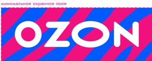
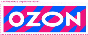
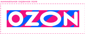
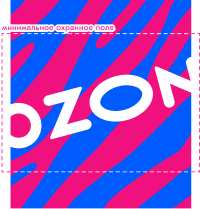
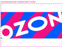
The clear space is based on the first letter "o" in the logo. Horizontal space requires the full width of the "o" on either side. Vertical space requires the full height of the "o" above and below.
Do not use other colors
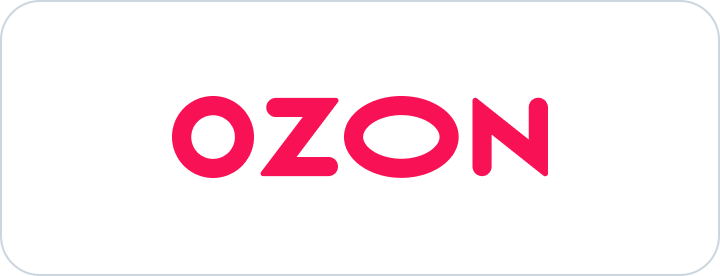
Do not violate the clear space

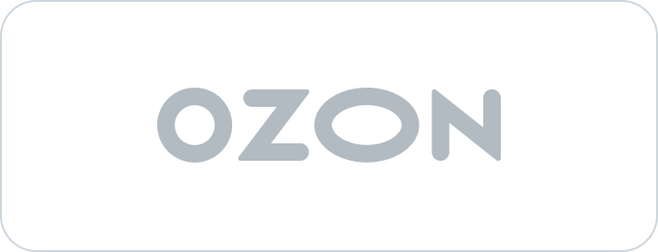
Do not use a gray logo in monochromatic designs.
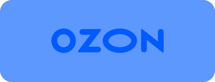
Do not use the logo against low-contrast backgrounds
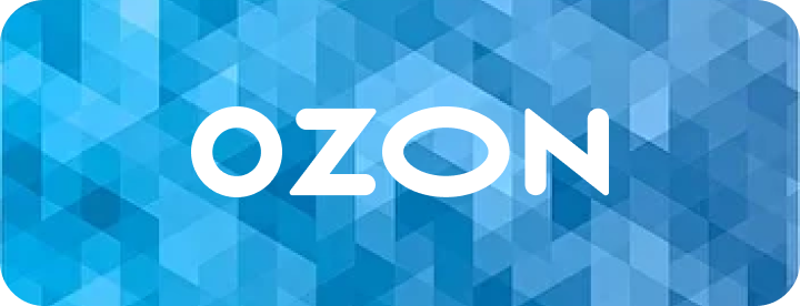
Do not place a logo on a busy or patterned backgrounds
Do not mix the logo with colors and shades that are not part of the company's color palette. The only exception is for co-branding purposes.
If the partner's logo is horizontal.
Add the signature "online store"
How to use the Ozon wordmark with your logo
Option 1
If the partner's logo is vertical.
Option 2
Vertical logo
If the partner's logo is horizontal.
Option 1
If the partner's logo is vertical.
Option 2
Template 1
The background with extra space allows one to easily adjust its size with the mask of any geometric shape. Make sure the background size is at least as large as the required clear space for the logo.
Logo for sellers' promotional materials
How to place the Ozon logo in a 16:9 video

Template 2
This template is used to place a logo on a large surface.
Its angled slope adds a dynamic touch, and the background is created with extra space so that you can easily adjust its size using a custom-shaped mask. Make sure the background size is at least as large as the required clear space for the logo.
Its angled slope adds a dynamic touch, and the background is created with extra space so that you can easily adjust its size using a custom-shaped mask. Make sure the background size is at least as large as the required clear space for the logo.
The width of the Ozon logo in 16:9 format videos is 1/6 of the width of the 16:9 format.
1
The logo is placed exactly in the Title Safe Area in one of the corners.
2
The lower clear space is bigger than the bottom panel of the player, the Skip button and the pop-up banner.
3

Use eye-catching icons to emphasize the Ozon brand in promotional materials. If the icon doesn't fit the designated shape and a distinctive format is needed, feel free to utilize one of the available templates.
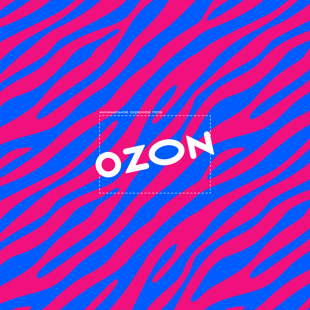
Examples of framing
Examples of framing
Correct use:
Incorrect use:
Correct use:
Incorrect use:
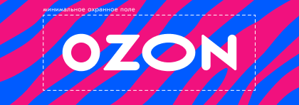


Example
Example


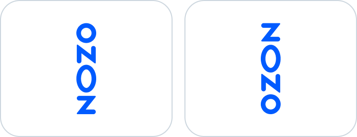
Do not place the logo vertically
Approved logo colors are white and blue. The logo should be placed on a clear and consistent corporate background that contrasts well with it.
Approved logo colors


Basic colors
Monochrome colors
The black and white version of the logo is used when color printing is not possible. In this case, it is recommended to select the logo color based on the background's saturation level.
Addtitional guidelines for using logo
—
—
—
—
—


The minimum logo angle is 7 degrees
The maximum angle for the logo is 15 degrees
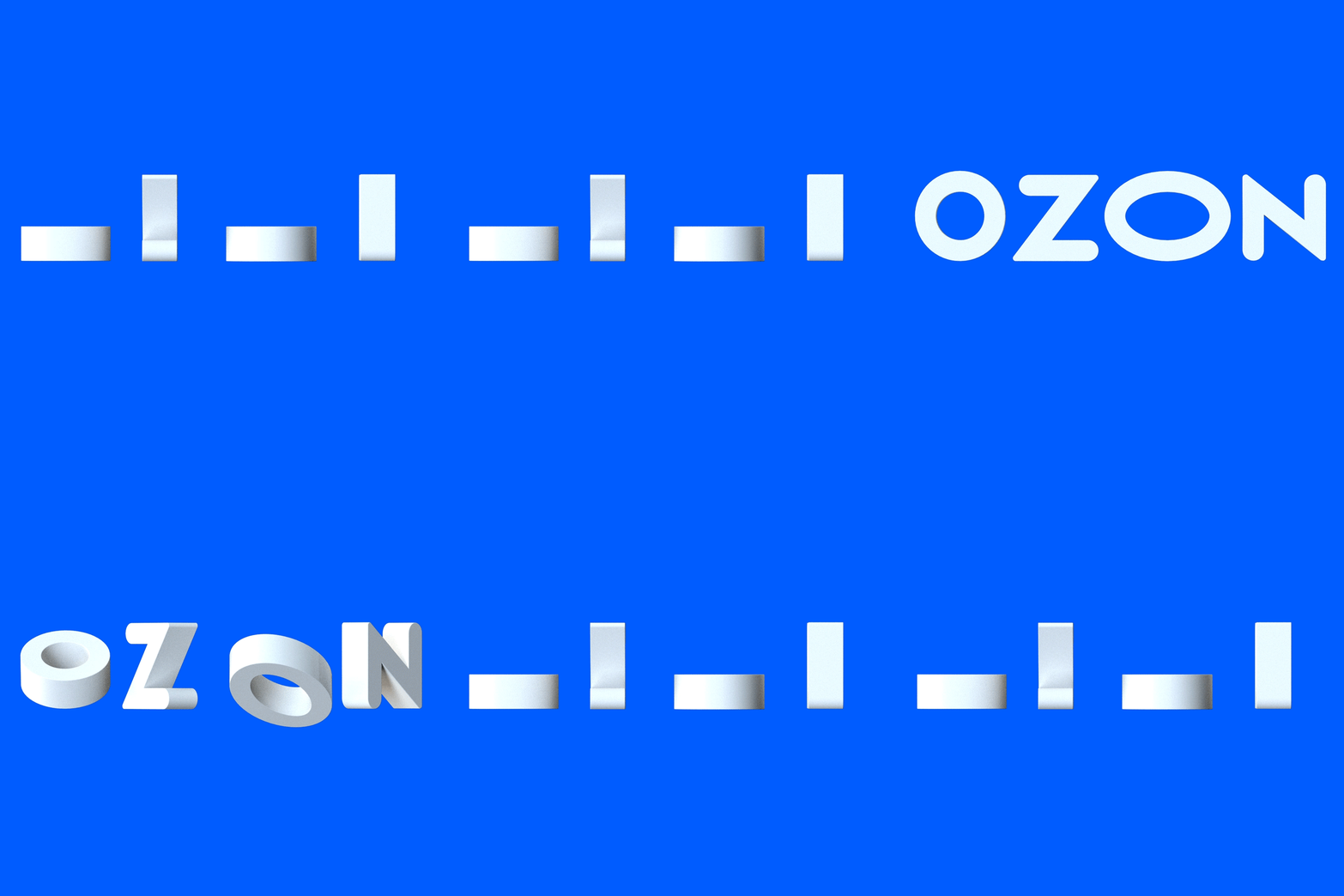
The letters "O" and "N" are cut halfway through their thickness
The maximum angle for the logo is 15 degrees
The letters "O" and "N" are cut halfway through their thickness
—
—
—
—
—
Ozon logo in co-branding
Logo colors
Priority should be given to a blue logo on a white background or a white logo on a blue background
You can place a white logo on any partner's solid background color or image that is consistent


«Buy on Ozon» badge design
Logo placement rules
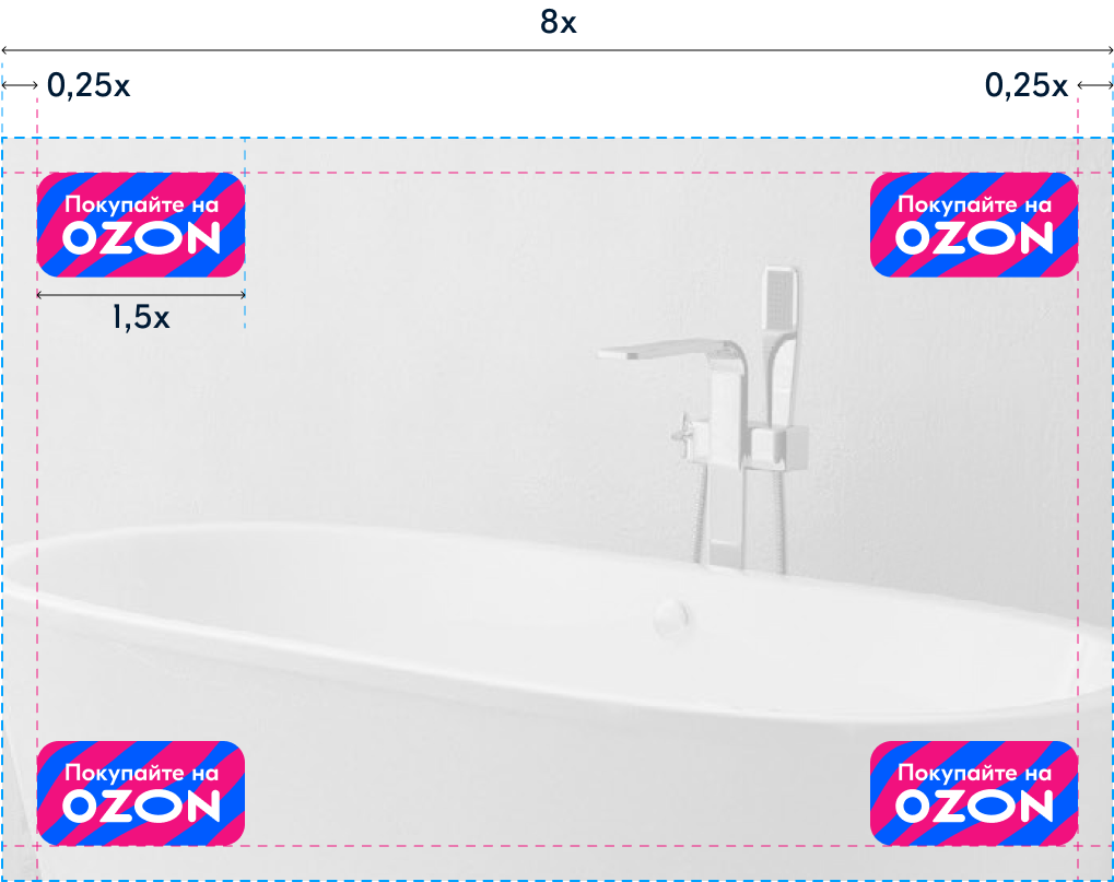
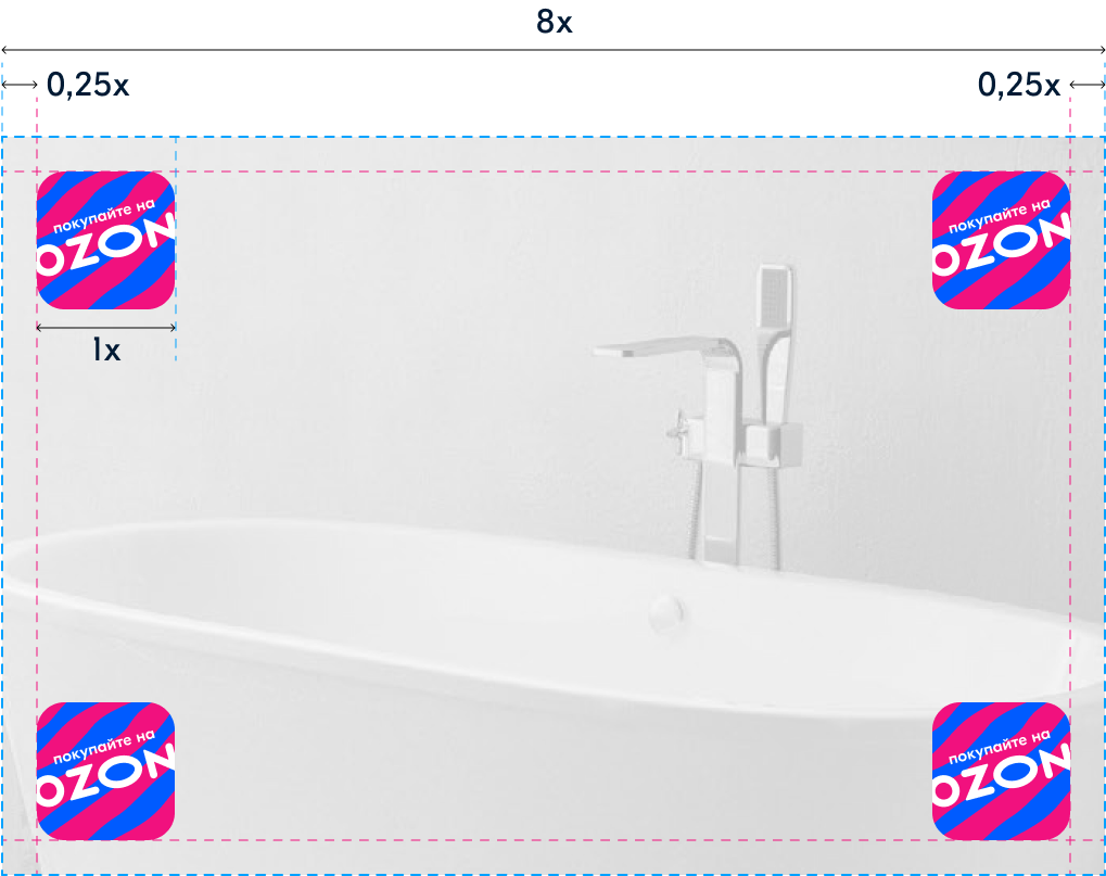
The badge should be positioned in any corner of the advertising banner, at a distance of at least 0.25x from the edge of the banner.
1
When selecting the badge size, think about the advertising format and ensure that the wording is easy to read.
The suggested badge size is 1/8 of the larger dimension of the advertising format. You can calculate this by using the formula: X = “larger side of banner” / 8.
The suggested badge size is 1/8 of the larger dimension of the advertising format. You can calculate this by using the formula: X = “larger side of banner” / 8.
Do not change the proportions of the sides of the badge.
2
3

Building examples
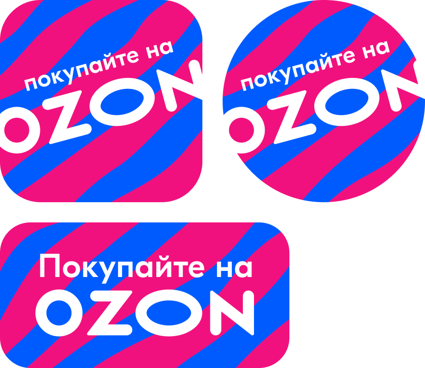
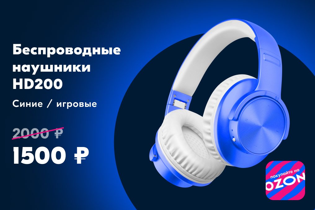
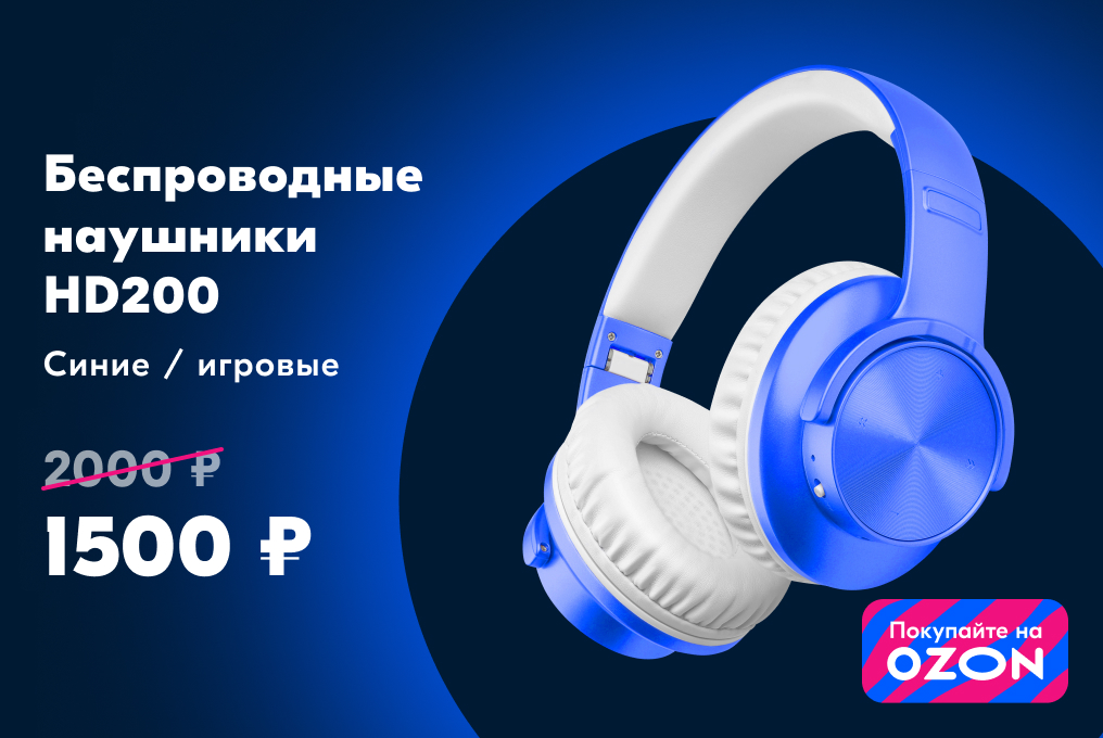
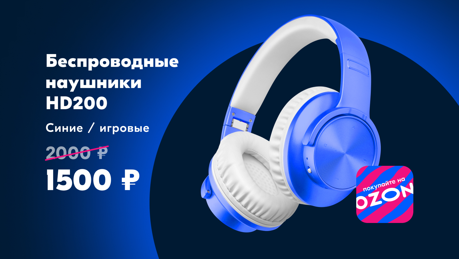
It is used to advertise a product from a partner or seller. The badge can be square, circle, or rectangle.
Examples


Guidelines for using icons for promo assets
2D
3D
The Ozon icon
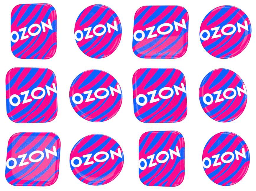
Available in both 2D and 3D formats, the Ozon icon is always bright and recognizable. The shape of the icon can be round or square with rounded corners.
* All allowed perspectives in the icon pack
Usage examples
Acceptable
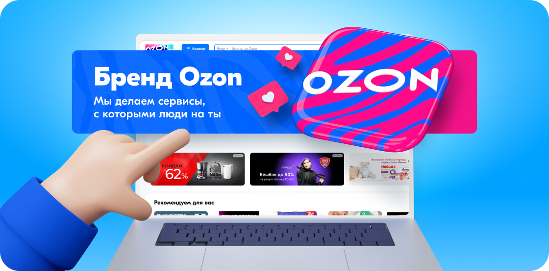
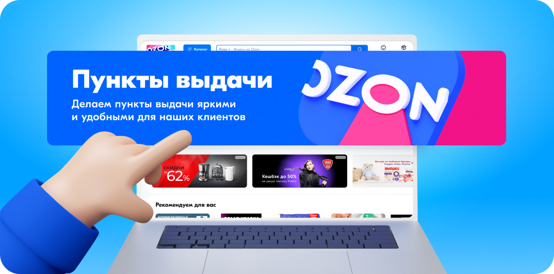
Use only the approved zebra pattern with an icon. Overlap with other images is allowed up to 10%, provided the Ozon logo remains visible.
Not acceptable
An outdated ray icon is used. Overlapping of more than 10% of the icon’s visible area. it’s crucial to stick to the approved rotation angles from the 3D icon pack. Using other perspectives is not allowed.
Ozon colors
Additional colors
The main colors are Ozon blue and Ozon magenta. In graphic materials, we combine them in a ratio of 60 to 40, favoring blue
Primary colors
Ozon blue
HEX
RGB
CMYK
Pantone
RAL
Oracal
Pantone Cotton Planet
RGB
CMYK
Pantone
RAL
Oracal
Pantone Cotton Planet
005BFF
0 91 255
100 40 0 0
3005 C
5015
641 052
18-4252 TCX
0 91 255
100 40 0 0
3005 C
5015
641 052
18-4252 TCX
Ozon magenta
HEX
RGB
CMYK
Pantone
RAL
Oracal
Pantone Cotton Planet
RGB
CMYK
Pantone
RAL
Oracal
Pantone Cotton Planet
F1117E
241 17 126
0 100 10 0
219 С
4010
641 041
18-2436 TCX
241 17 126
0 100 10 0
219 С
4010
641 041
18-2436 TCX
Morning blue
HEX
RGB CMYK Pantone
RGB CMYK Pantone
00A2FF
0 162 255
87 0 0 0
2995 C
0 162 255
87 0 0 0
2995 C
Orange star
HEX
RGB
CMYK
Pantone
RGB
CMYK
Pantone
FFA800
255 168 0
0 41 94 0
3514 C
255 168 0
0 41 94 0
3514 C
Green grass
HEX
RGB
CMYK
Pantone
RGB
CMYK
Pantone
00BE6C
0 190 108
80 0 80 0
2464 C
0 190 108
80 0 80 0
2464 C
Dark space
HEX
RGB
CMYK
Pantone
RGB
CMYK
Pantone
001A34
0 26 52
67 46 0 88 2965 C
0 26 52
67 46 0 88 2965 C
For CMYK palette uses
the FOGRA 39 color profile
the FOGRA 39 color profile
Pantone Solid Coated
For CMYK palette uses
the FOGRA 39 color profile
the FOGRA 39 color profile
Pantone Solid Coated
For CMYK palette uses
the FOGRA 39 color profile
the FOGRA 39 color profile
Pantone Solid Coated
For CMYK palette uses
the FOGRA 39 color profile
the FOGRA 39 color profile
Pantone Solid Coated
For CMYK palette uses
the FOGRA 39 color profile
the FOGRA 39 color profile
Pantone Solid Coated
For CMYK palette uses
the FOGRA 39 color profile
the FOGRA 39 color profile
Pantone Solid Coated
Accent colors
Common examples of combinations
Using color combinations
It is important to follow these principles. Color is one of the basic elements of a brand, and distorting the proportions outlined weakens the connection to the brand and depersonalizes communication.
The primary colors of the brand are Ozon blue and Ozon magenta. Secondary colors highlight and complement primary colors, and can also outweigh Ozon magenta in backgrounds and illustrations. In total, the proportion of accent colors should not exceed 10 per cent.
Do's — approved color combinations
Don'ts — forbidden color combinations


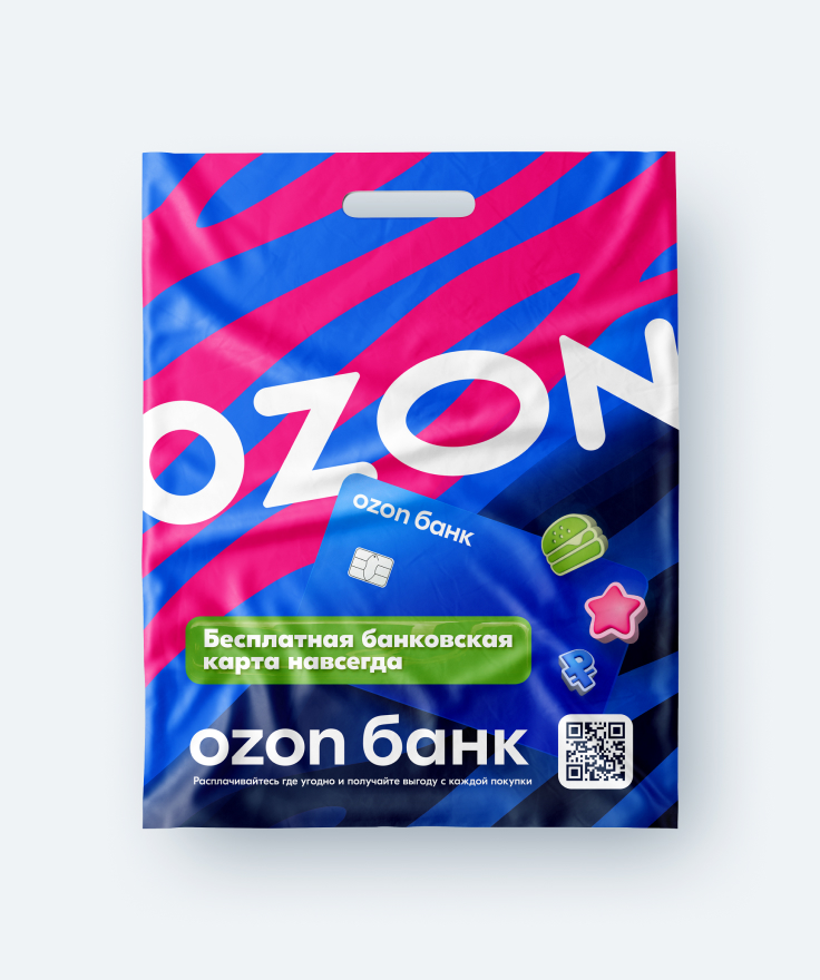
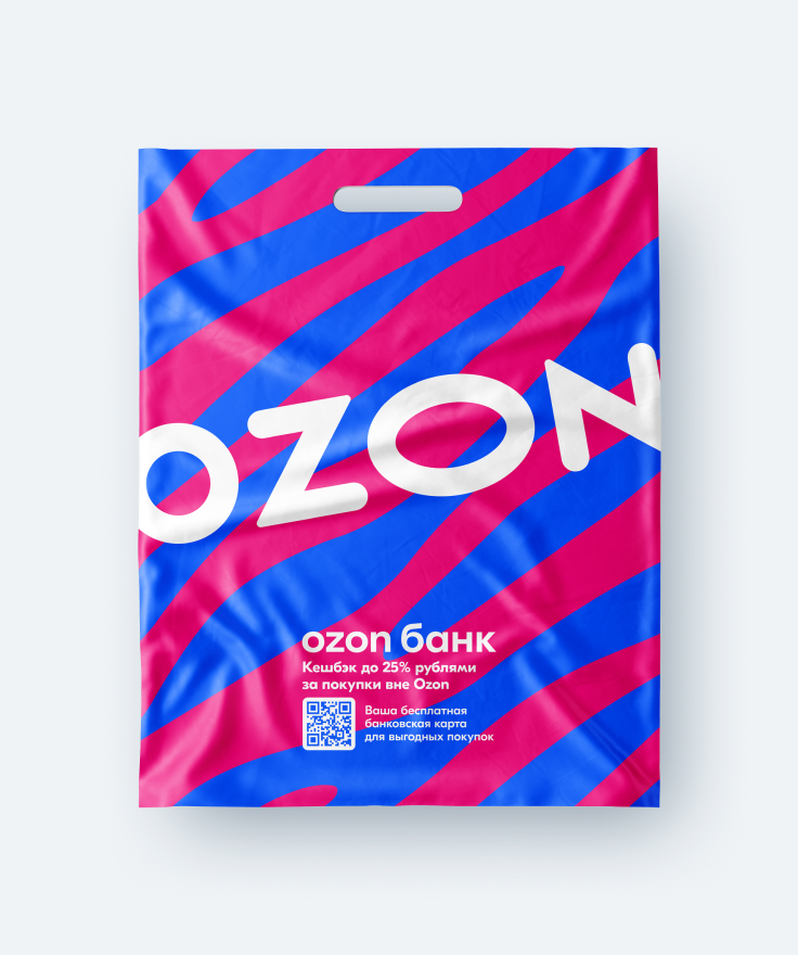
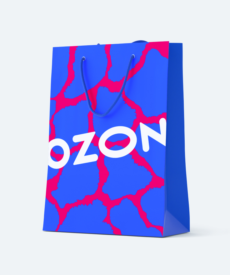
Packaging
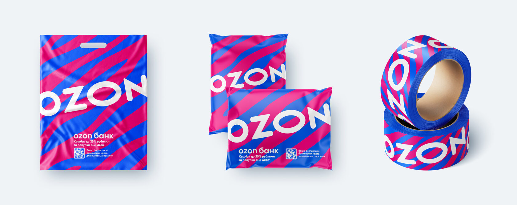
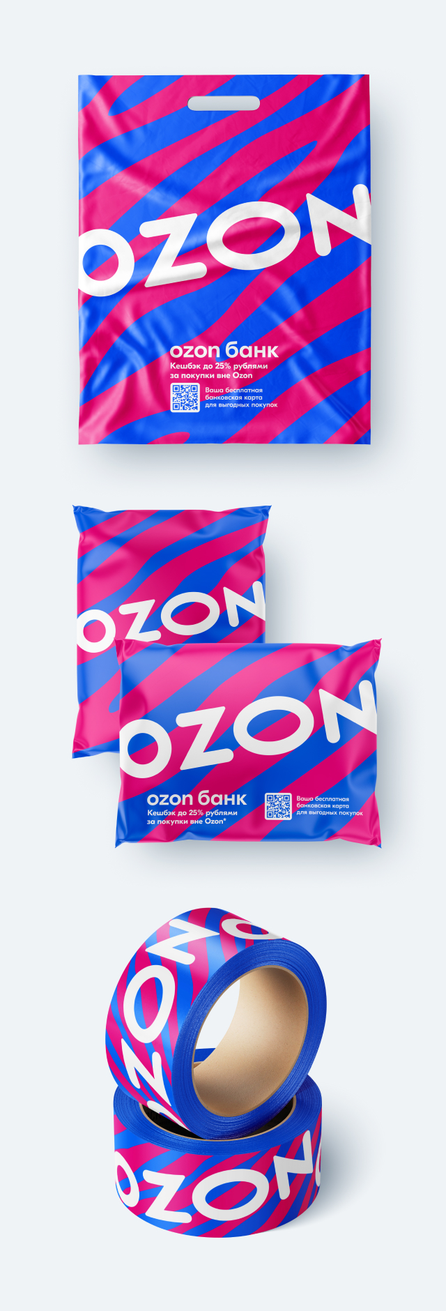
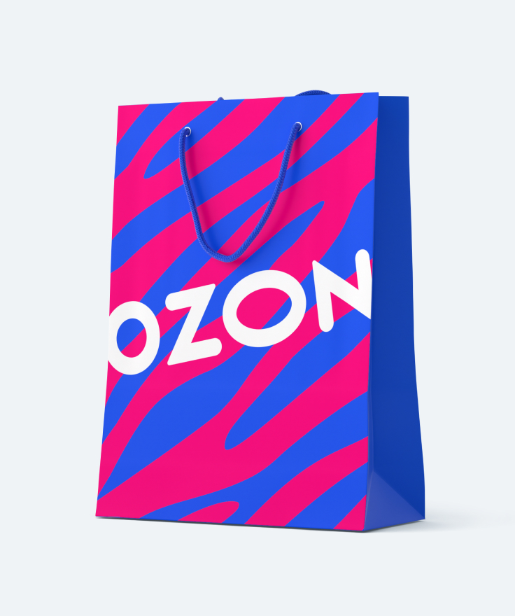
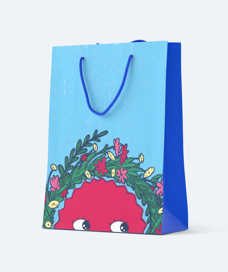
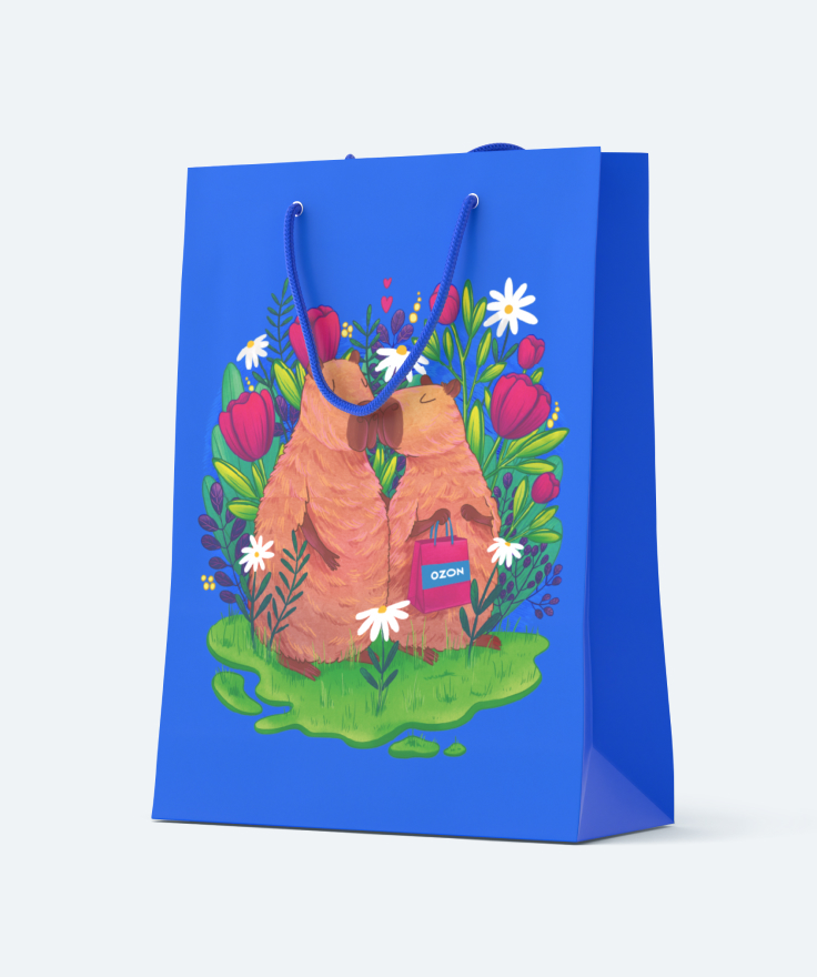
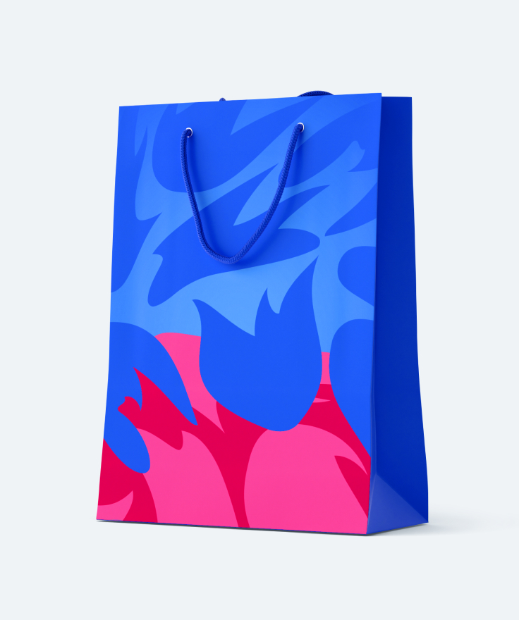
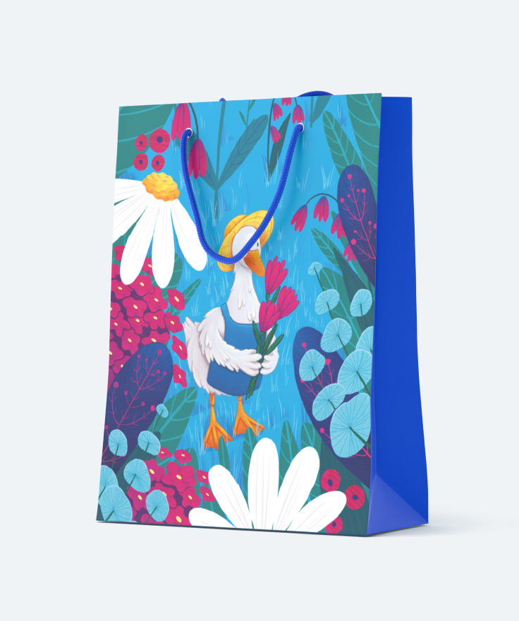
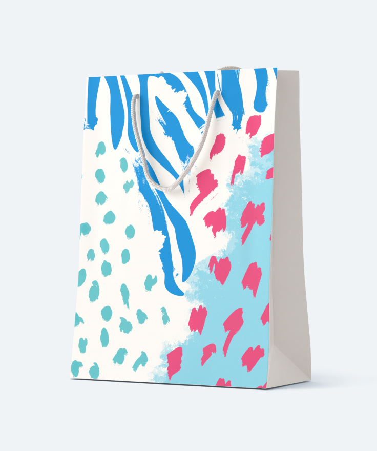
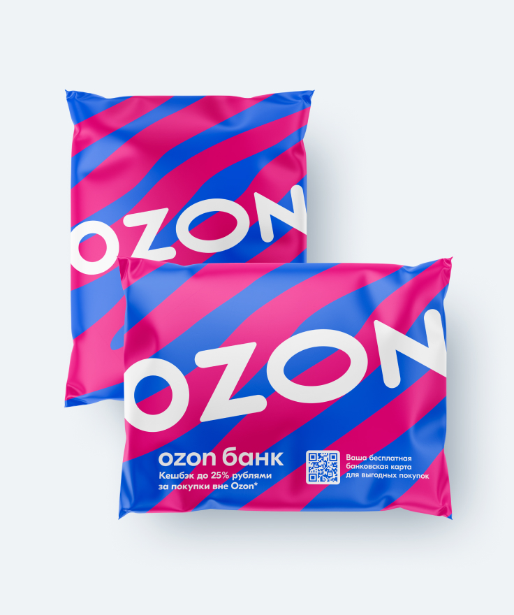
The unboxing experience has become even more emotional thanks to the eye-catching branded packaging design.
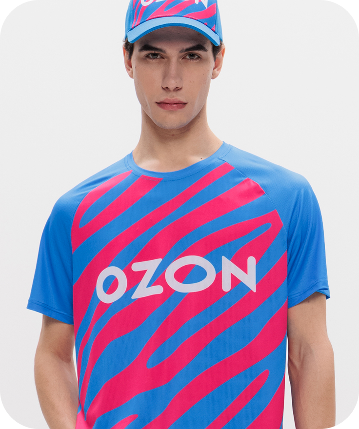
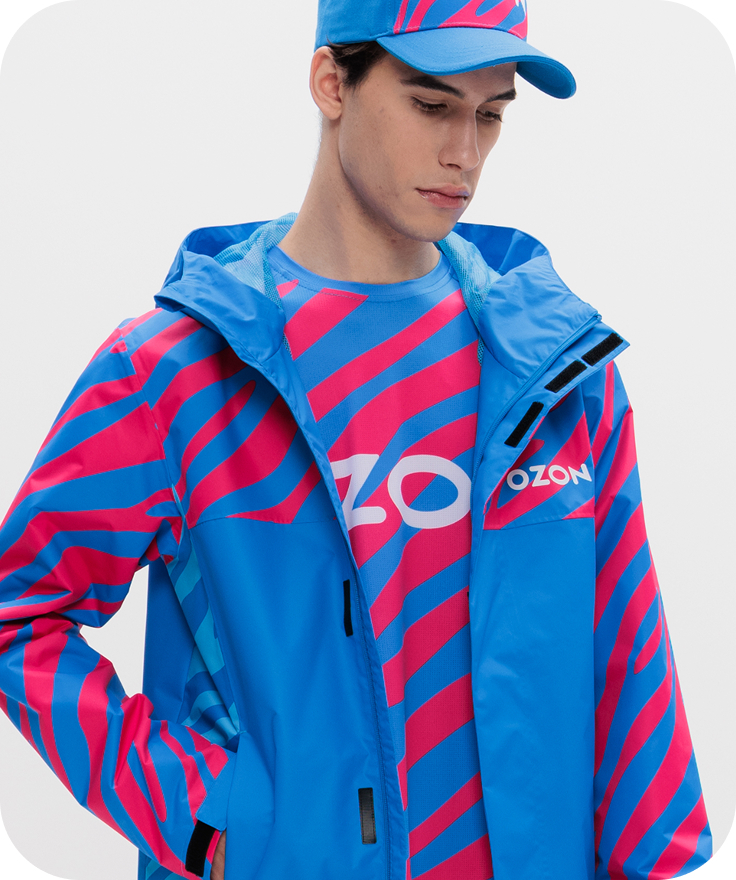
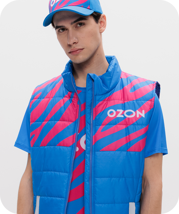
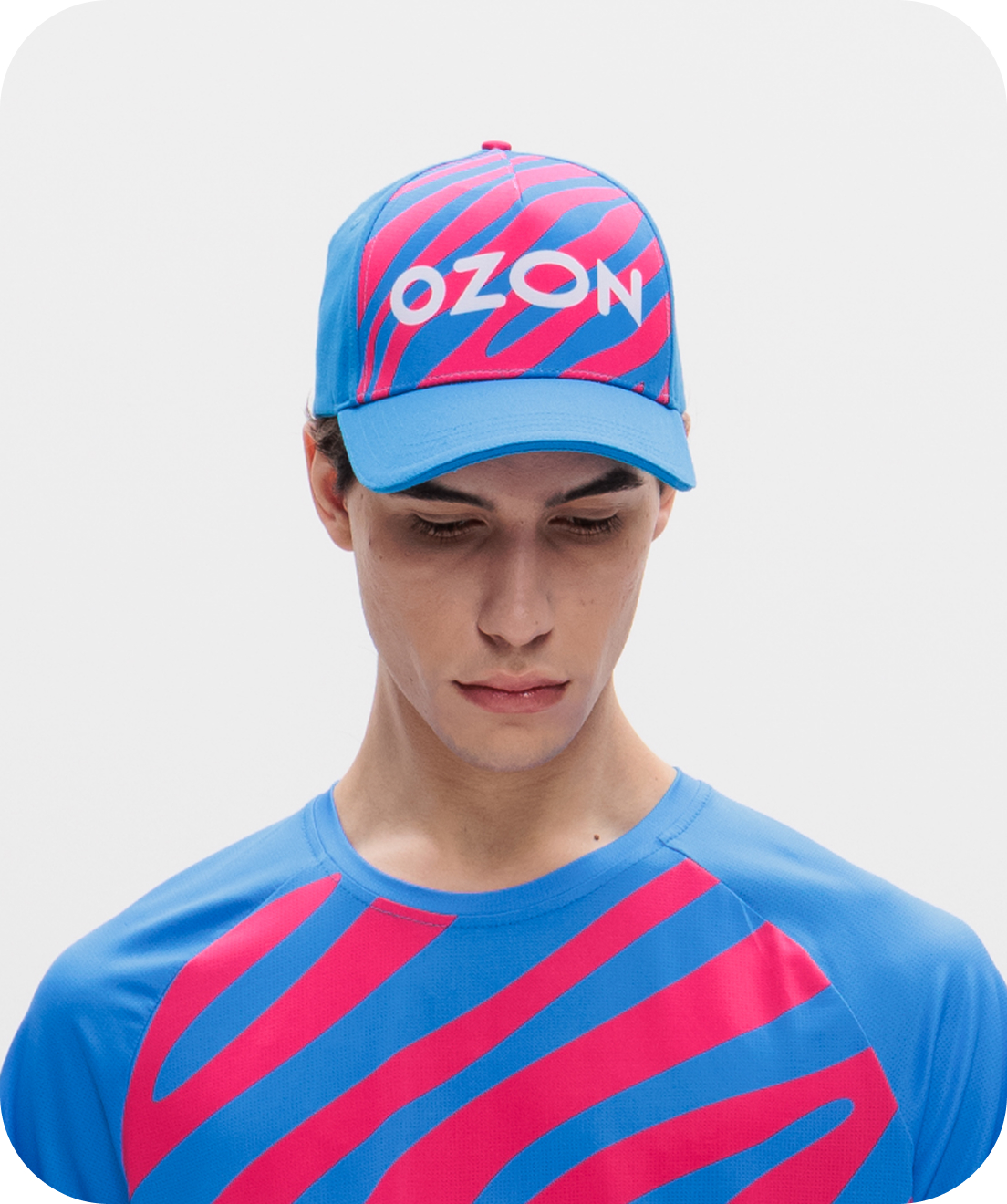
Uniform
Our uniform is designed with you in mind: it is comfortable, made from natural materials and easy to wear, wash and iron.
Brand collateral
Ozon branding accompanies our customers all the way — from placing an order on the website to picking up a product. Thousands of bright couriers, cars, parcel lockers and pick-up points are everywhere.
Brand collateral
Ozon branding accompanies our customers all the way — from placing an order on the website to picking up a product. Thousands of bright couriers, cars, parcel lockers and pick-up points are everywhere.
Packaging
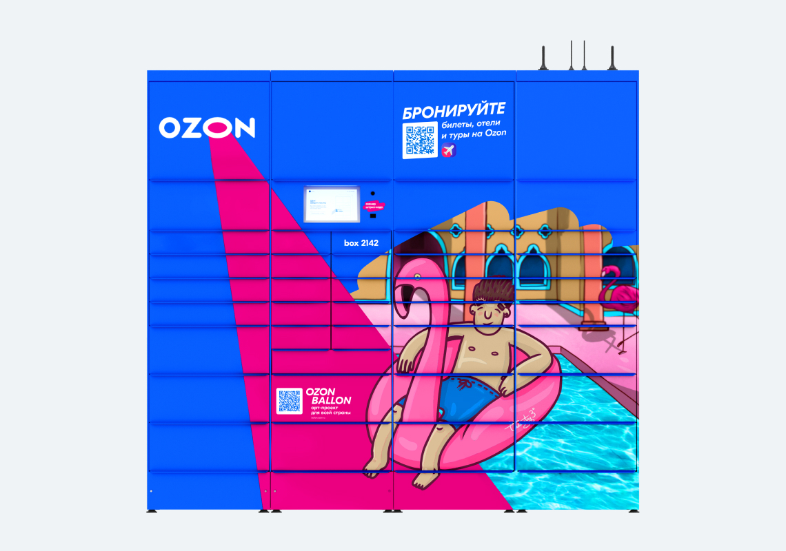
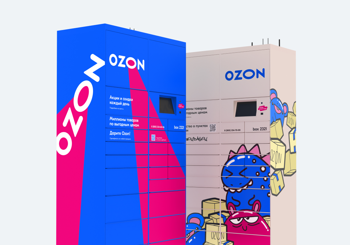
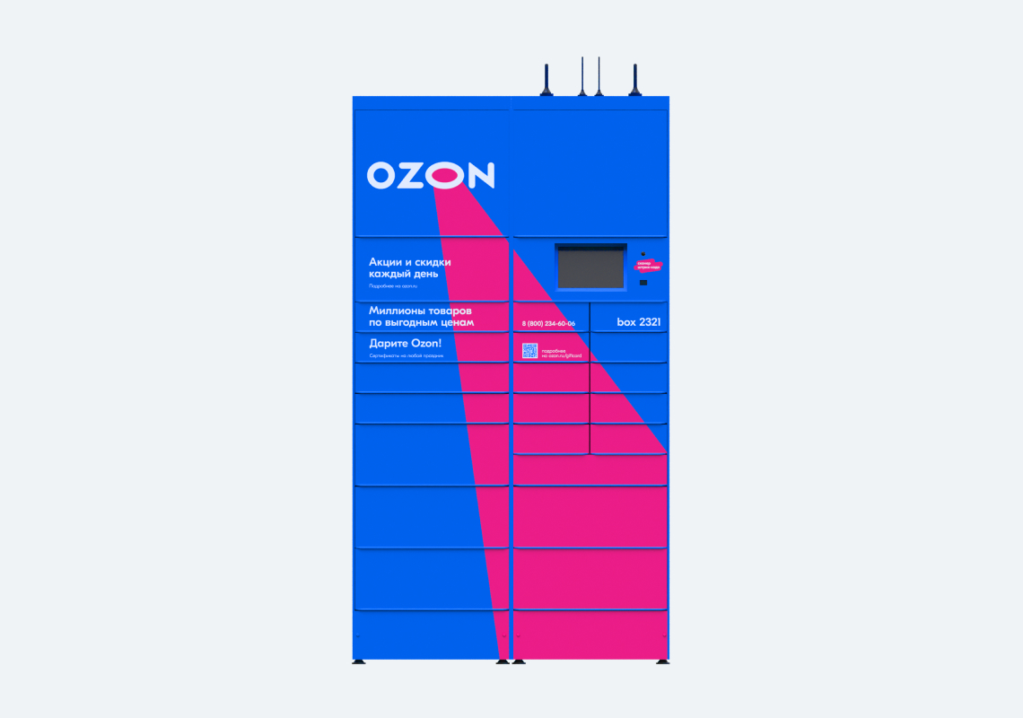
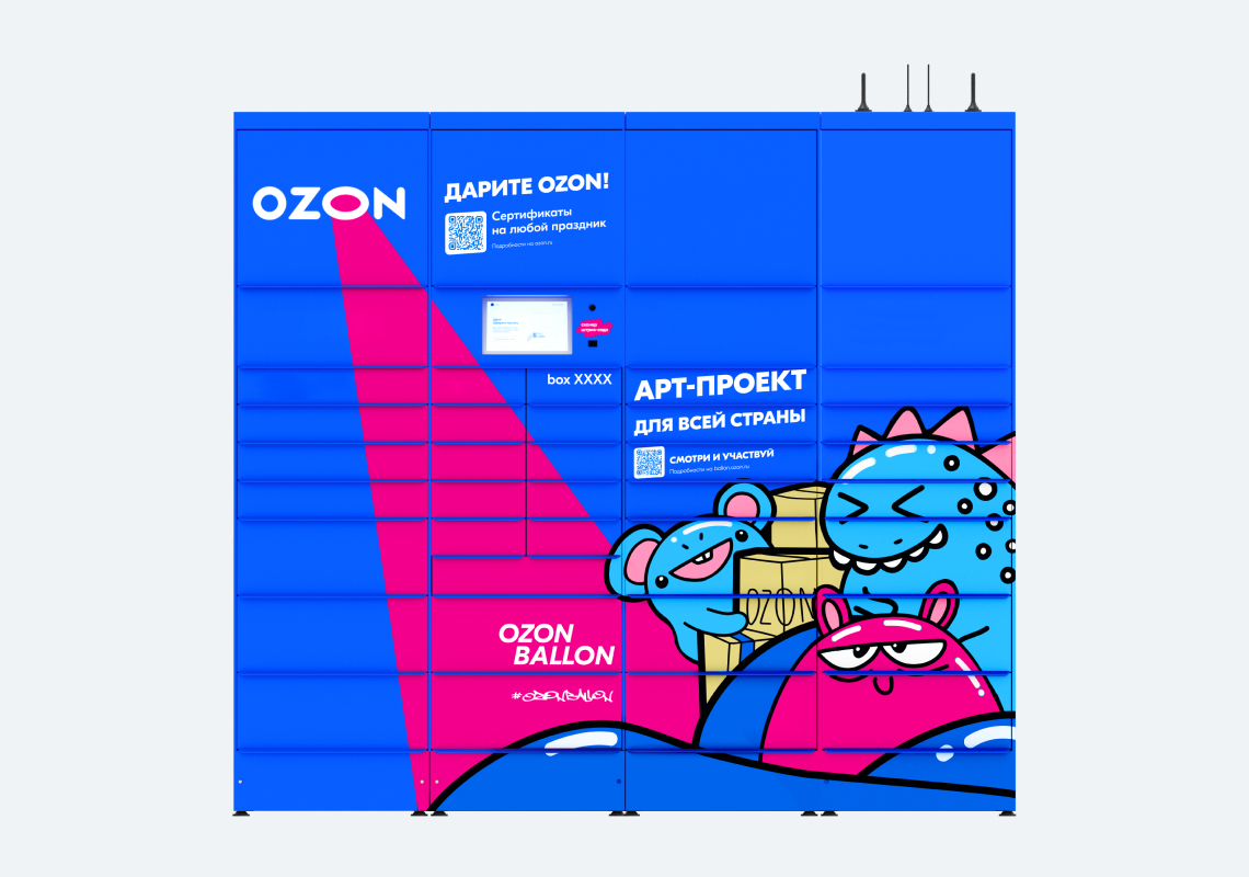
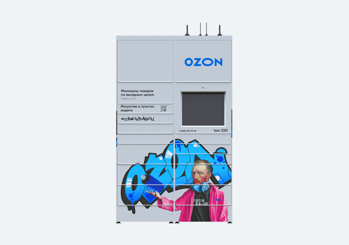
Parcel lockers
Shopping malls, supermarkets and shops near the house — Ozon parcel lockers are in their proper places. With their bright design and user-friendly interface, they are easy to find and easy to use.
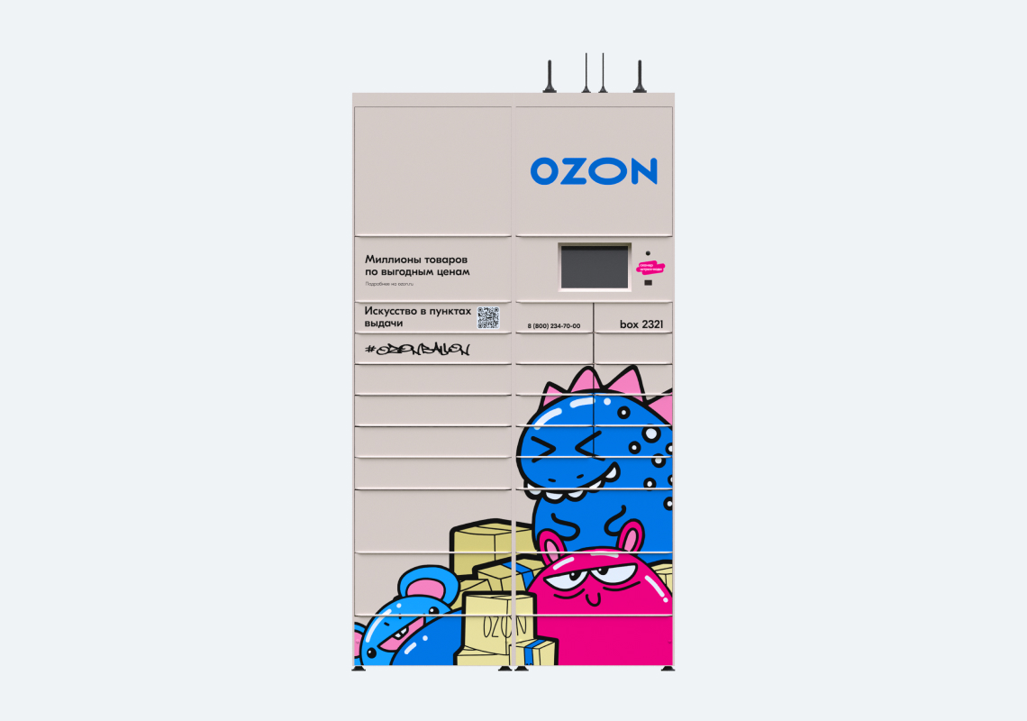

360˚ pick-up points
Pick-up points are friendly and functional spaces that create an excellent customer experience.
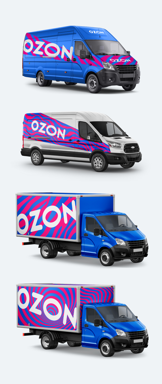
They are in the driver's seat
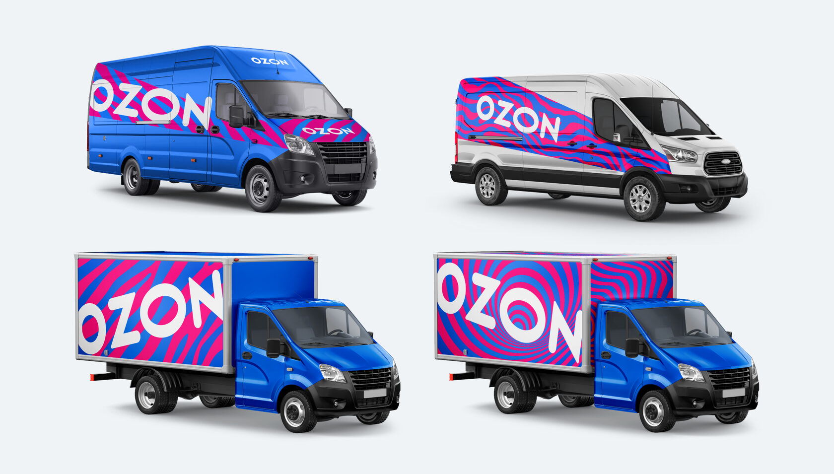
Thousands of people see them every day — on busy streets and quiet courtyards, on their way to work or when they get home. 1,000+ cars flood the streets of towns and cities across the country every day.
Rigid branding guidelines can limit creativity, and this approach does not work for us. We like to think outside the box and are always open to creative ideas, new projects and inspiring collaborations.
Quite a different story


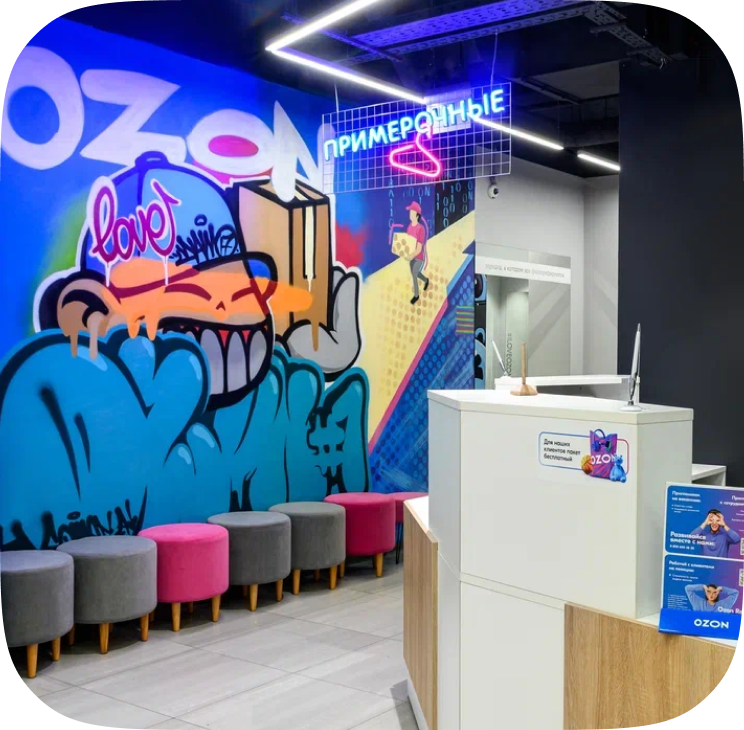

You only need a cool idea to take part in the project. We provide art tools and supplies as well as an ideal wall to boost your creativity.
The Ozon Ballon initiative is a creative collaboration between our brand and artists from all over the country. We select the creatives of the participants and introduce them into the Ozon branding, turn order pick-up points into works of art, draw at festivals, cooperate with different brands and participate in various projects.

The first collection offers T-shirts, sweatshirts, raincoats and accessories in the branded colors, Ozon blue and Ozon magenta.
The new 2021 collection is even brighter and more relaxed with comfortable oversized clothes, color gradients and favorite all-time classics. All items can be easily mixed and matched to create many different outfits.
The new 2021 collection is even brighter and more relaxed with comfortable oversized clothes, color gradients and favorite all-time classics. All items can be easily mixed and matched to create many different outfits.


ALCOR jewelry in your favorite colors
A unique collaboration
with ozon merch!
with ozon merch!


There is no place like Ozon home
To help people create a comfortable environment at home, we offer well-designed, functional, durable and affordable home accessories.
We work every day to make your life easier and more comfortable. Thanks to the new useful services, we can deliver faster and reach more people. And our customers and partners are happier.
Our services
Ozon fresh


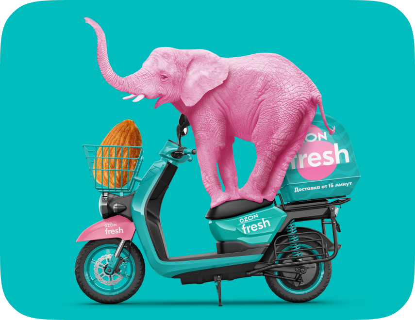
Ozon fresh is a wide range of fresh and natural products for the whole family. It is focused on FMCG product range, which is mainly oriented towards Russian craft producers and farmers: cheese, milk, meat, vegetables and fish.
Ozon Забота



Ozon Care makes donations easy. Create positive giving habits with Ozon. When you shop at Ozon, you are not only shopping, you are also helping those in need.
Ozon Travel


Ozon Travel offers a service for booking affordable hotels, tickets, and tours worldwide. Our platform provides easy search options, 24/7 support, and cashback miles, making it a convenient, reliable, and profitable choice for travelers.
Guidelines for using our wordmark and logo
Correct use:
Incorrect use:
The main logo
Additional logo
Guidelines for writing the name of the service
Ozon fresh logo
We use the Latin name of the service in all our materials. The word 'Ozon' is capitalised, and the word 'fresh' is not.
Ozon fresh
Ozon Fresh
Ozon fresh primary colors
Guidelines for using our brand symbol and logo
Correct use:
Incorrect use:
Logo without a brand symbol
Logo with a brand symbol
Guidelines for writing the name of the service
Ozon Travel Logo
In all text materials we write the name of the service in Latin and capitalized letters
Ozon Travel
Ozon travel

Clear space
If the background matches one of the logo colors, it is recommended to add a shadow below the logo.
Logo on different backgrounds

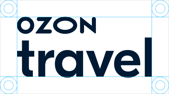
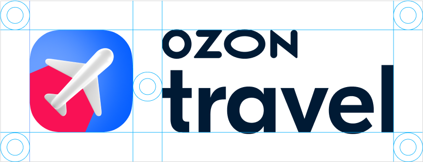
Clear space is based upon the letter "o" in the logo. Horizontal space requires the full width of the "o" on either side. Vertical space requires the full height of the "o" above and below.
Ozon Travel color palette
The colors of the Ozon Travel brand
Use the proposed color gradients, but feel free to use non-standard ones as well.
The key is to ensure a smooth transition from warm to cool.
To achieve this, opt for either warm colors or cool colors exclusively.
The key is to ensure a smooth transition from warm to cool.
To achieve this, opt for either warm colors or cool colors exclusively.
Typography
For headings, we use GT Eesti Pro Display.
There are three options available:
UltraBold for headings of special projects,
Bold for banner headings and subheadings of special projects,
and Regular for large headings.
There are three options available:
UltraBold for headings of special projects,
Bold for banner headings and subheadings of special projects,
and Regular for large headings.
There are two versions of writing the logo: Ozon Travel with a brand symbol and and without one. If the logo is used without an icon, the layout must include a brand symbol
3D brand symbol
Please refrain from using it for now!



Main
HEX
RGB
CMYK
Pantone
RGB
CMYK
Pantone
005BFF
0 91 255
100 31 0 0 3005 C
0 91 255
100 31 0 0 3005 C
Sales
HEX
RGB
CMYK
Pantone
RGB
CMYK
Pantone
F91155
249 17 85
0 100 0 0
Process Magenta C
249 17 85
0 100 0 0
Process Magenta C
Background
HEX
RGB
CMYK
Pantone
RGB
CMYK
Pantone
FFFFFF
255 255 255
0 0 0 0
White
255 255 255
0 0 0 0
White
Text and background
HEX
RGB
CMYK
Pantone
RGB
CMYK
Pantone
001A34
0 26 52
100 42 22 82
303 C
0 26 52
100 42 22 82
303 C
For text blocks with more than three lines, we use GT Eesti Pro Text.
We offer two types of fonts:
Regular for small text formats
and Book for large text formats.
We offer two types of fonts:
Regular for small text formats
and Book for large text formats.


Ozon Travel + Partner's logo
Horizontal logo
Option 1 Partner's logo with a symbol
Option 2 The partner's logo without a symbol, long
Option 3 Partner's logo with a symbol in two lines
Option 4 The partner's logo without a symbol in two lines


Vertical logo
Option 1
Partner's logo with a symbol
Partner's logo with a symbol
Option 2
The partner's logo without a symbol, long
The partner's logo without a symbol, long
Option 3
Partner's logo with a symbol in two lines
Partner's logo with a symbol in two lines
Option 4
The partner's logo without a symbol in two lines
The partner's logo without a symbol in two lines


Q&A
The font plays an important role in communication with our customers and partners. Every detail matters — size, color, position, background. That's why Ozon uses only its proprietary fonts — GT Eesti, Pro Display and Pro Text.
Our main colors are the primary Ozon blue and saturated Ozon magenta. You can download an extended version of the main brand palette with secondary colors.
Our current logos are publicly available. You can download the Ozon logo in various formats (.eps, .svg, .pdf, .ai) and in CMYK and RGB color models.
When customers collect their orders, we offer soft branded packaging and convenient branded carrier bags with the Ozon logo and 'Giraffe', 'Zebra' and 'Wave' prints.
We adapt Ozon's corporate identity to all kinds of scenarios and brand collateral — car branding, pick-up points, parcel lockers, staff uniform, packaging, and merch. We also have a cool, bright project that you just cannot miss: Ozon Ballon.
We tried to think through every last detail when designing the uniform. It is made of bright and natural fabric and matches a branded color palette.
Brand
360˚ pick-up points
Fulfillment
Auto merch
